PINGACES BRAND
LOGO & USAGE
GUIDELINES
One flagstick, four variants, zero guesswork. Everything you need to use the PingAces identity correctly.
01 — PRIMARY LOGO
The lockup
The primary logo pairs the flagstick mark with the PINGACES wordmark in Outfit 800. Use it in headers, footers and anywhere the brand is introduced.
LIGHT — for paper & light surfaces
DARK — for plum & dark surfaces
MONO LIGHT — single-color on light
MONO DARK — single-color on dark
02 — SECONDARY MARK
The flagstick
The standalone mark is the app icon, favicon and social avatar. It works where the brand is already established or space is tight.
COLOR
MONO LIGHT
MONO DARK
03 — SPACING & SIZE
Give it room
Clearspace
Keep clear space equal to half the mark's height on all four sides. Nothing — text, imagery, UI edges — enters this zone.
Minimum sizes
Primary lockup: never below 120 px wide on screen (35 mm in print). Standalone mark: never below 24 px. Below that, the flag detail is lost.
04 — COLOR
Electric Coral system
Coral
#FF6B6B
Primary actions, CTAs, the brand mark
Hot Pink
#EE5A70
Accents, hover states, highlights
Magenta
#C44569
Depth accents, ground arc in the mark
Plum
#574B90
Dark sections, ink and structure
Paper
#FAF6F2
Light app background
- Coral is the one primary action color. Never recolor the mark.
- Wordmark: plum ink on light surfaces, paper on dark surfaces.
- On coral or hot-pink backgrounds, use the mono-dark (paper) logo — never the color mark.
- Mono versions are for single-color contexts: print, embroidery, fax-era scorecards.
05 — APP ICONS & SPLASH
On the home screen
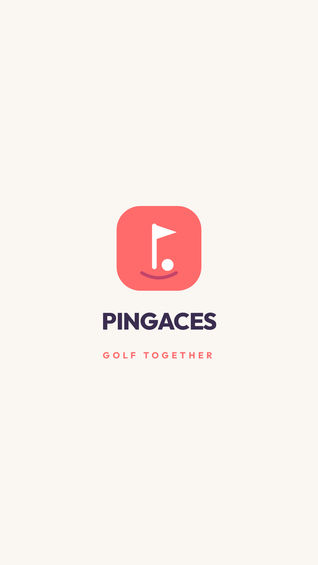
App icons are full-bleed coral — the platform applies its own mask, so never add rounded corners yourself. The Android adaptive set pairs the white foreground art with a solid coral (#FF6B6B) background layer. Splash screens center the color lockup on paper.

MASTER ICON · iOS

ADAPTIVE · ANDROID
SPLASH · ALL PLATFORMS
06 — MISUSE
Please don't
- Don't stretch, rotate or add shadows and effects.
- Don't swap brand colors for gradients or new hues.
- Don't place the color mark on coral, hot pink or photography with low contrast.
- Don't rebuild the wordmark in another typeface — it's always Outfit 800.
07 — ASSETS